Nordzucker AG
A forward-oriented corporate website for one of the world's leading sugar producer
Background & goals
Nordzucker AG is an impressive company: the Germany-based group has been producing sugar from sugar beets since 1838 – locally with short transportation routes, under highest standards and in close cooperation with the farmers. Nordzucker AG has continued to grow in recent years and is nowadays one of the leading producers in Scandinavia, Eastern Europe and Australia. The slogan “THE Sugar Company” sums up what Nordzucker is all about.
Sustainability, attractiveness of the workplace, transparency in the value chain and product information have a high priority among today’s generations and were particularly relevant for the new corporate website. In addition, the website needs to address the special information needs of Nordzucker’s shareholders.
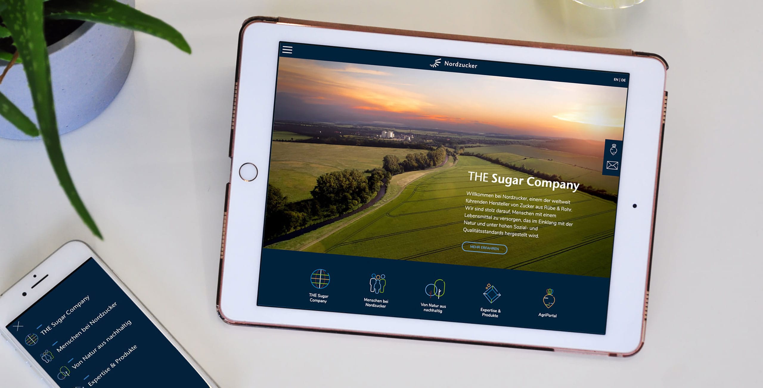
With Nordzucker, we have taken an unconventional approach for a corporate website: The site has an engaging magazine-like character instead of a bureaucratic tree structure.
The “Mobil Macher”-solution
We Mobil Macher had the privilege of developing the strategy and concept of the new Nordzucker website as well as programming it. Together with the graphic designers from MioMio, we evaluated the requirements for the new website and, based on this, designed the BIG PICTURE concept, which allows the group to represent themselves with a good level of self-confidence. The global view of Nordzucker AG is expressed on the content level as well as in the image and design language. Strong images and contrasting colors give guidance to the viewer’s eye and promote understanding of the content. On the new Group website, which is available in German and English, content from the previous country websites was also brought together and combined into a large, coherent whole. The focus was always on the essentials: the requirements of the target group.
Another highlight of Nordzucker AG’s new digital presence are the unique icons: the main website sections and the elements of the “Toolbox” have been given individual and multicolored icons, greatly simplifying orientation. “Fact Boxes” and further article suggestions at the bottom of the page arouse the website visitor’s curiosity and invite them to delve deeper into the world of Nordzucker.
Features of the new corporate website
The Group’s website is a real image booster. Compared to many other corporate websites, it looks fresh and dynamic and has a magazine-like character instead of bureaucratic and unattractive structures. It is an example of how a modern corporation can position itself within the current possibilities of the digital world. Potential applicants will already see Nordzucker as an attractive employer on the basis of the website.
Usability was another focus of the development: the website makes it easy for the viewer to reach and understand the content on all devices – from smartphones to tablets to desktop PCs. An ultra-sharp font makes reading easier, quicklinks and an innovative slide menu allow fast access to specific topic areas. Other special features include a download area, a comprehensive contact database and the extensive news section. The digital magazine “Nordzucker Post” is also part of the new corporate website.
The website is build on an extremely lean code structure: This achieves a high page performance. It makes the use of the website particularly pleasant for the user and has a positive effect on the search engine ranking of the site. We used state-of-the-art technology that enables the website to remain a sustainable flagship of the Nordzucker Group, for today and any future extensions.
LINKS